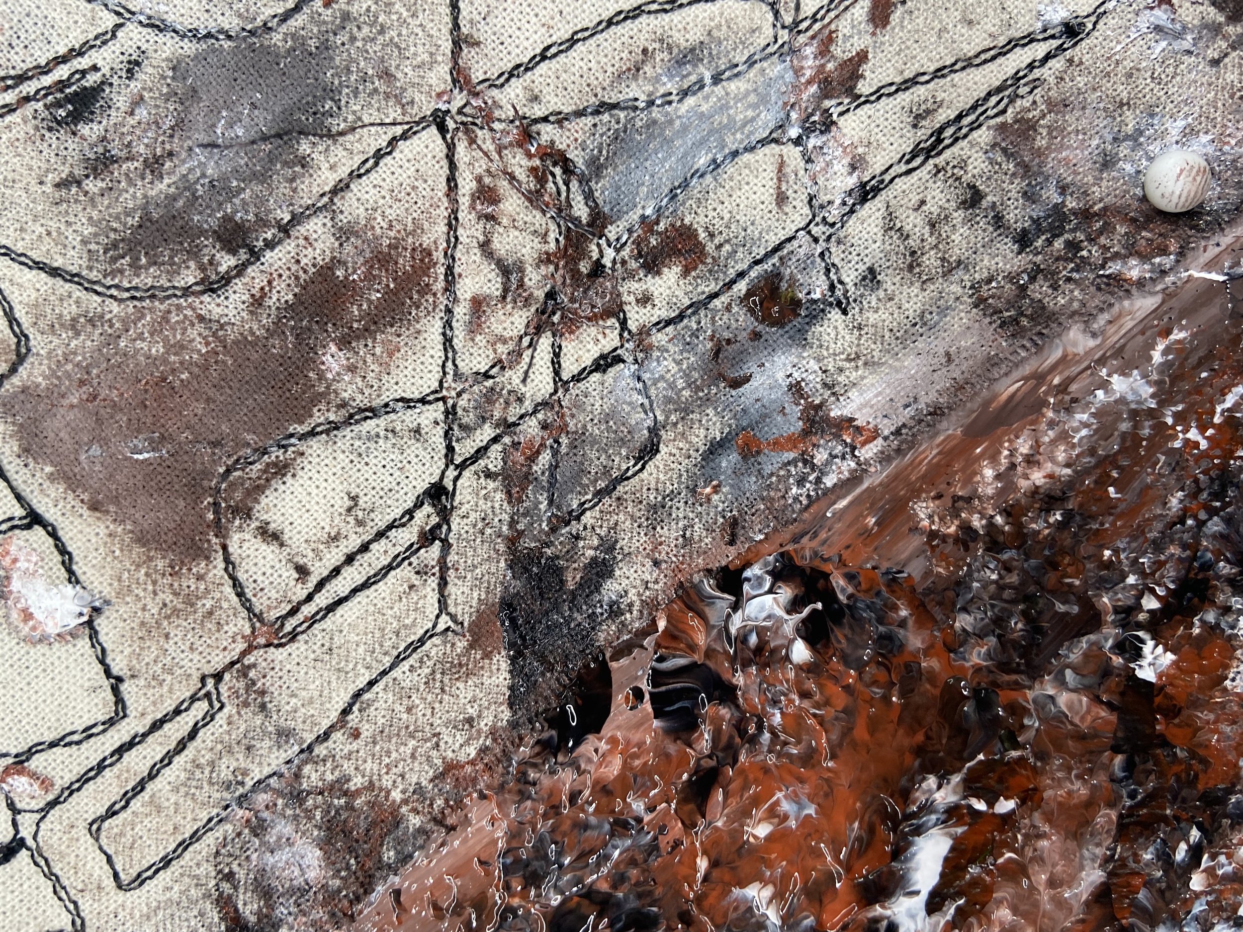
Thesis Project - Mapping Emotion Through Interior Surfaces 2022
INTRODUCTION
The integration of art into architecture can open many doors of discussion. It is a topic that is dictated depending on the approach you take. I am interested in the ability to display emotion through interior surfaces and space. This concept was something that developed by pure coincidence from the integration of large-scale canvases into confined interiors. This idea was explored by the forefathers of the Abstract Expressionism. The movement was mainly in New York during the 1950s – 1960s, with people such as Mark Rothko, Barnet Newman, and Jackson Pollock leading the charge. As the artists started to darken their pallets, increasing the size of their paintings, installing them together, in proximity, they started to dominate the viewers field of vision, becoming less visible as paintings and more as objects. As the canvases moved towards this scale, they began to emit architectonic qualities, creating a viewing experience in the space that felt more atmospheric rather than pictorial. The space became an extension of the work and allowed the user to become immersed in the motifs being displayed.
One could argue that this experience of the artwork helped one better understand the artist and artwork. Throughout my academic journey I have created process of design that can address, amplify and express motifs and notions being expressed in artwork by incorporating them into the design of the interiors which house them. The transcension of this concept into the built environment has the potential to create spaces that lay between the world of architecture and art, with expression being the main focal point of design. This incorporation of art into interior architecture and design has the potential to create spaces that express themselves onto the user, dictating their emotions and reactions within a space. This is an extremely powerful tool within the world of curation as it can have monumental effects on the audiences understanding of the journey and narrative you are representing.
Throughout this page I will explain the theory and inspirations I have taken to construct my concept and theory. Without the understanding and validation of these points in history, I would not have been able to construct my design process.
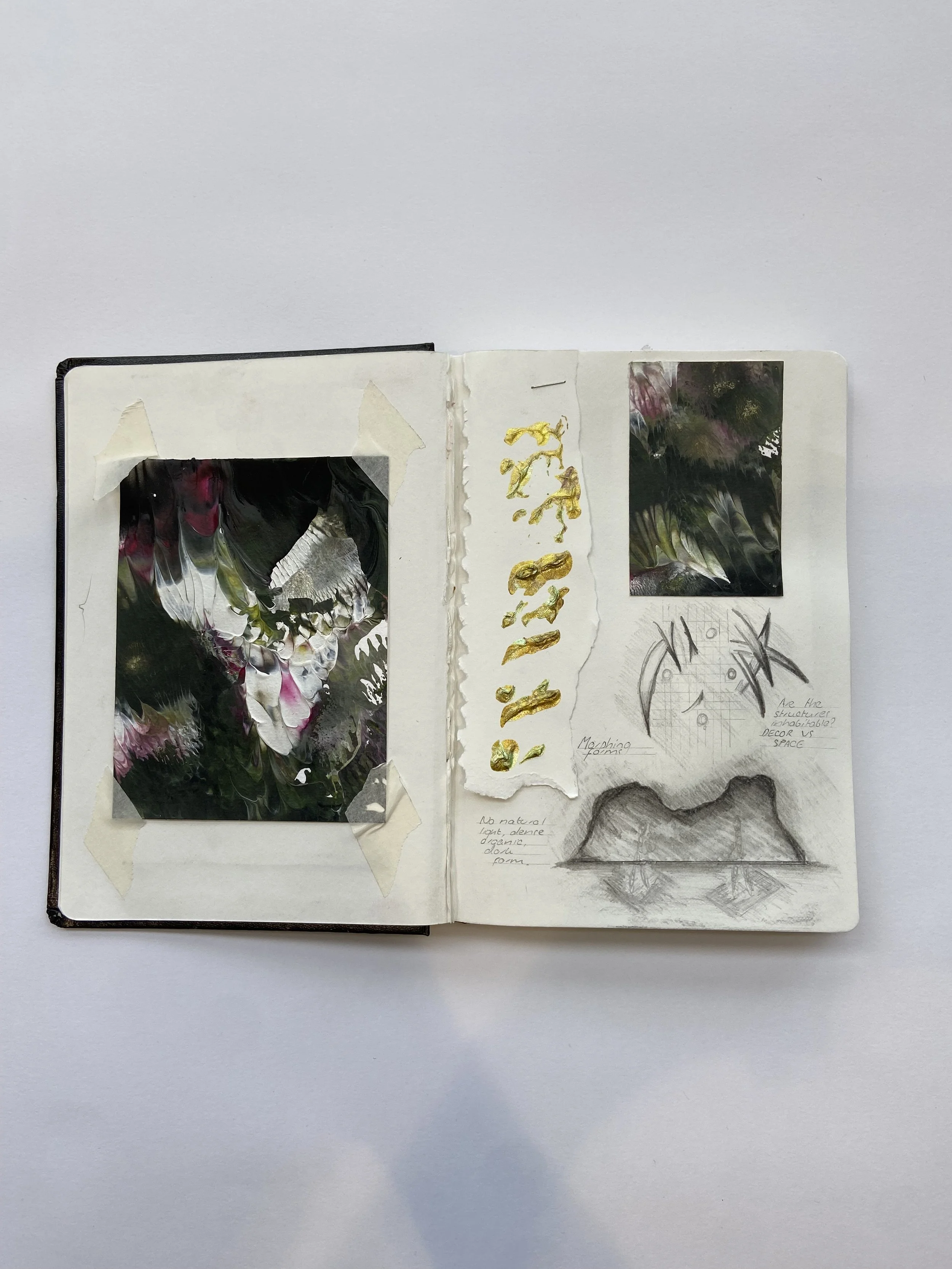
Sketchbook Image
A MODERNIST ETHOS
Currently, the routine approach to curation is very much based around history and sub-considerations of the paintings or artwork being displayed (such as technique and time period). Most exhibitions are not connected to their physical environment. The process I am presenting throughout my work is an extension of a classical curatorial approach to art. I am starting to connect the artwork to the architecture, creating a somatic, immersive experience.
This is done by highlighting certain focal points within the work, and extracting and amplifying them through a bespoke design process that allows me to incorporate them within the interior architecture which houses them. In a world where things are very much leant towards learning by interaction, this process could lead to the creation of spaces that, due to how they are experienced, can create a better understanding of the artwork and artist in question. These spaces will start to resonate on an emotional level, creating a memorable experience. Artwork can be described as an encounter with emotion. Since the spaces I am creating are directly formed from the artwork they could be described as a 3D encounter with an emotion. Once we start to create a physical encounter with these different motifs, we can start to better understand them and their narrative.
Sketchbook Image
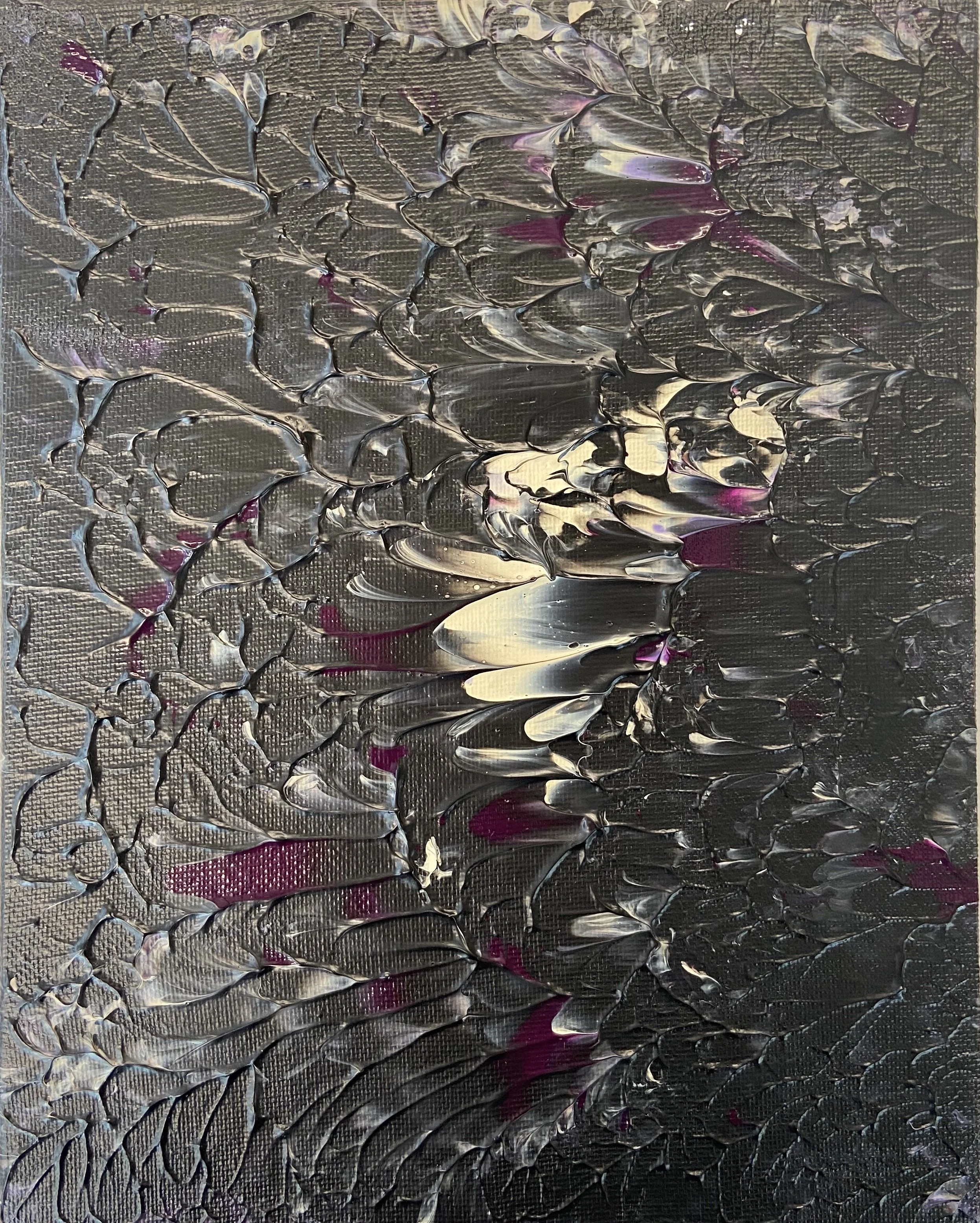
Melancholy Sadness - Original Artwork by KISU
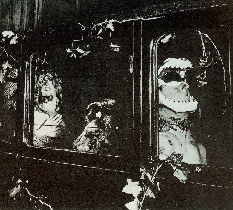
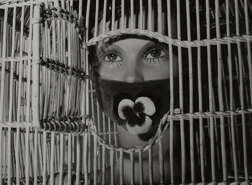
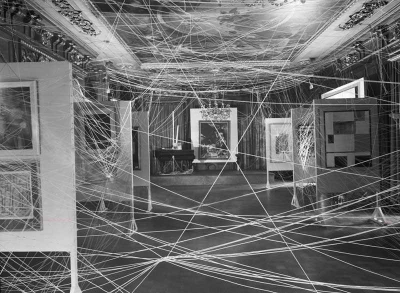
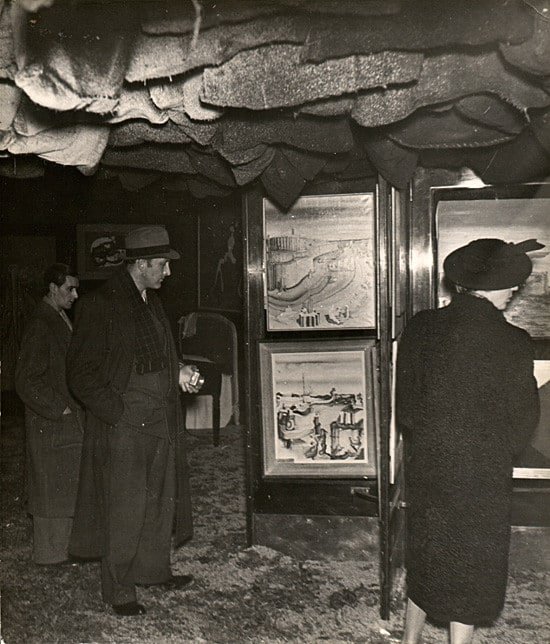
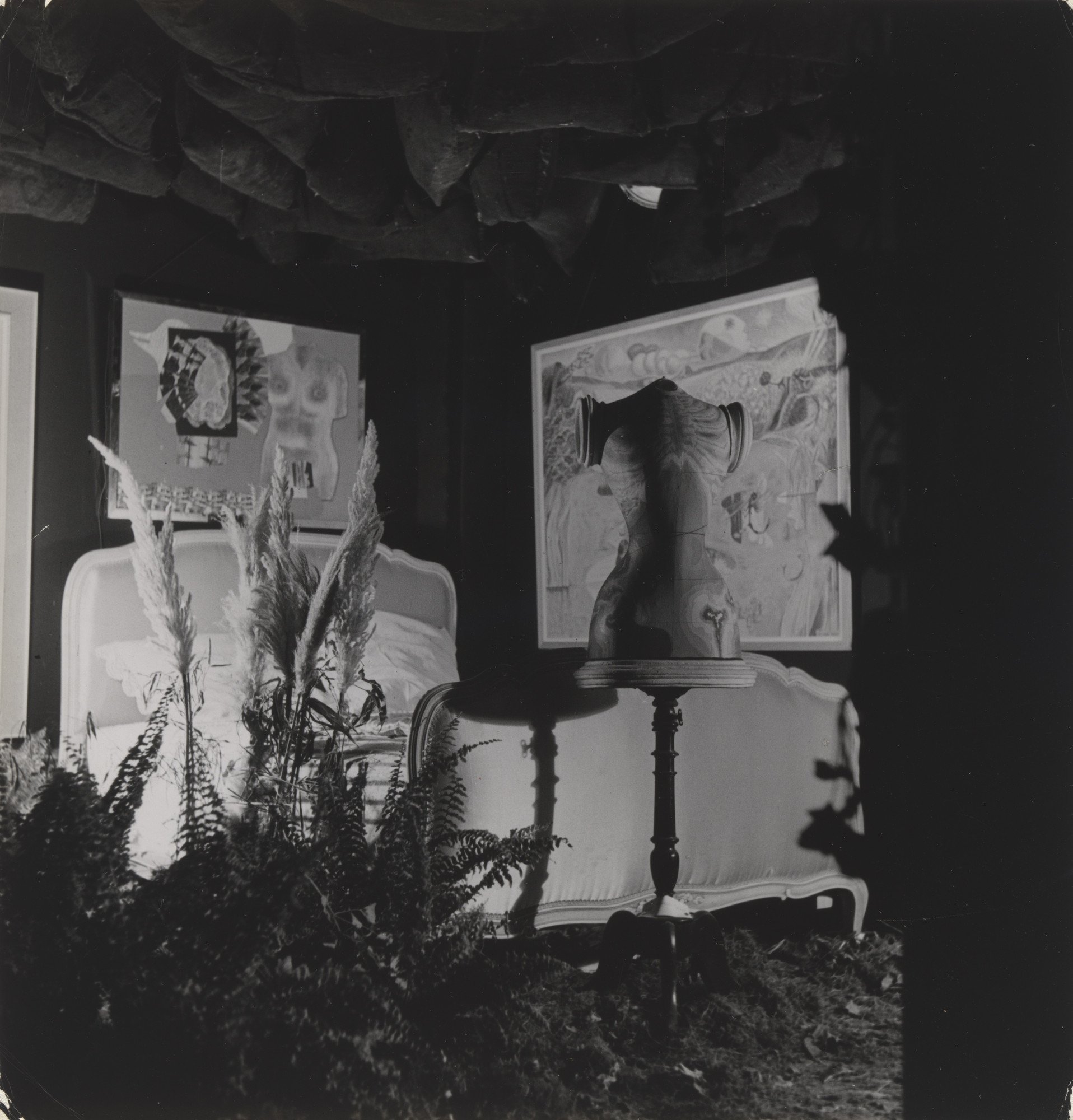
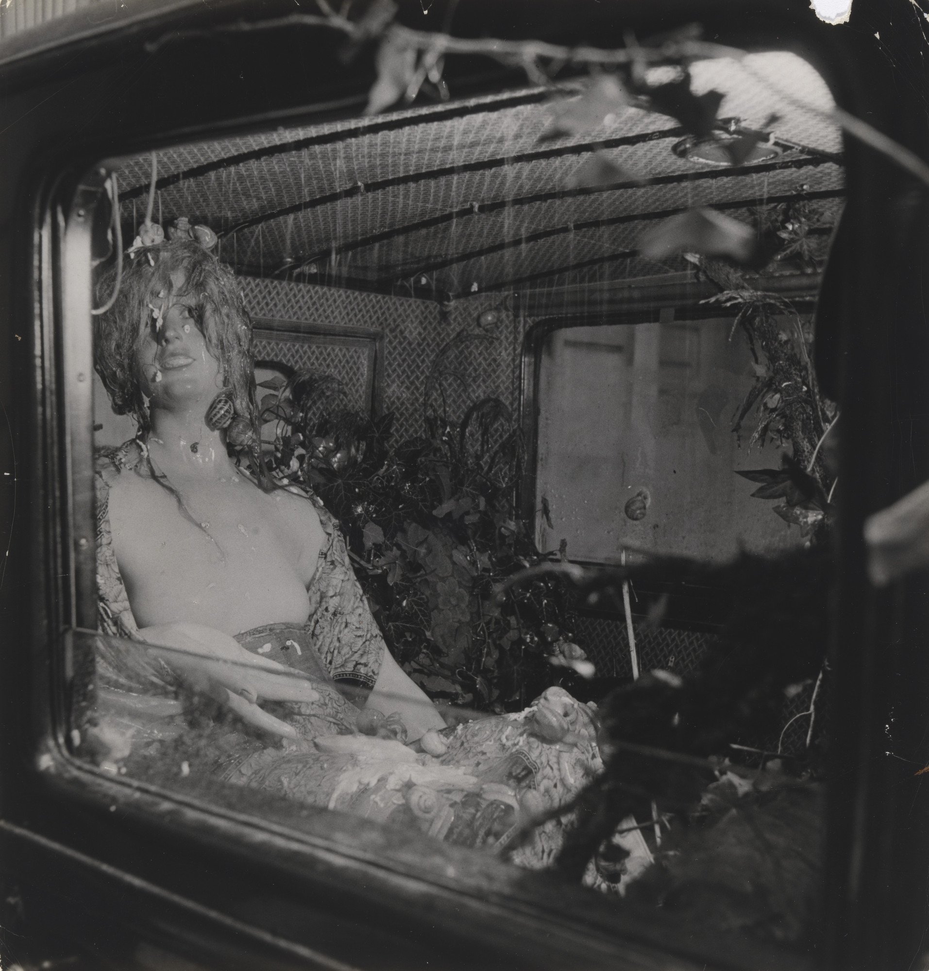

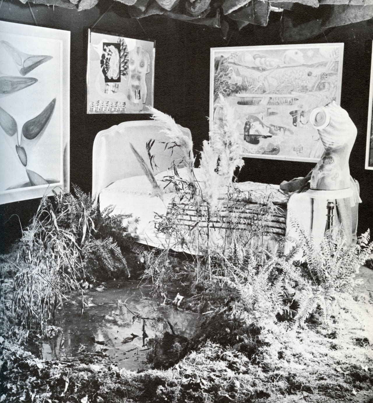
First Papers of Surrealism - 1942 - Gallery
CONCEPT IN CONTEXT
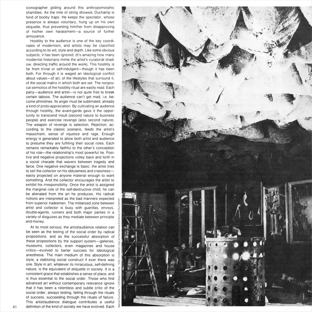
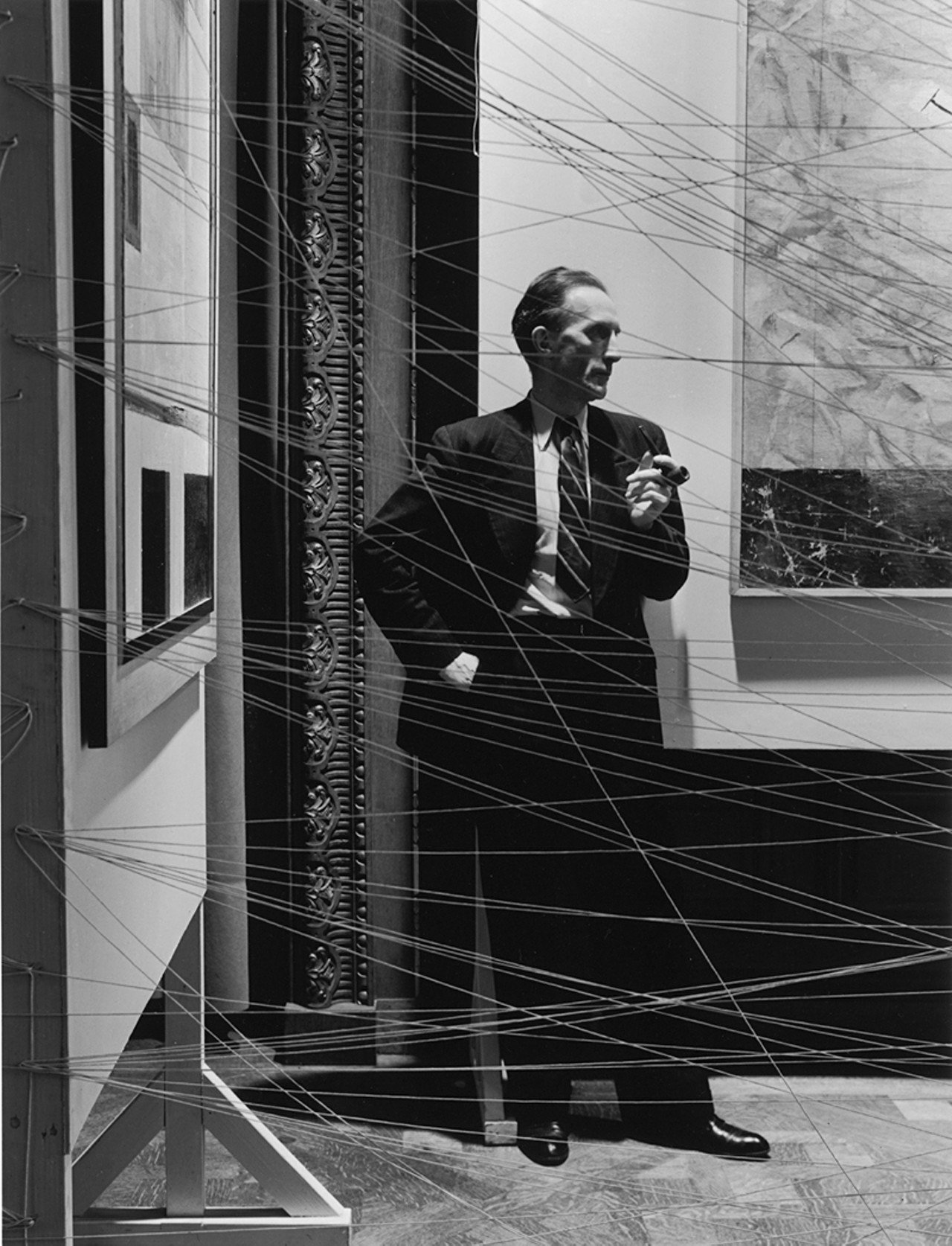
In 1942, Marcel Duchamp and his colleagues held an exhibition named ‘The First Papers of Surrealism’. This exhibition was the first of its kind where the space was adapted, blended and transformed into an extension of the artwork, projecting its narrative through the experience users have within the space. Marcel Duchamp’s design for the exhibition First Papers of Surrealism has long stood as a milestone in the history of installation art and innovative display techniques For this installation, Duchamp used twine to frame the art displayed within the Manhattan offices of the Coordinating Council of French Relief Societies. Duchamp’s twine created a web-like enclosure around the artworks on display, making an immersive multisensory space that held the potential to influence or transform a visitor’s experience of the art. New York Times art critic Edward Alden Jewell situated the exhibition in the heat of World War II by calling it “surrealism’s all-out against the Axis”. Jewell’s opening-day preview of First Papers thus borrowed the patriotic hyperbole of the day. With this phrase, he proclaimed the exhibition space as a battleground where the surrealists would give their all to defeat the Axis powers of Germany, Italy, and Japan.
First Papers of Surrealism 1942 - New York Times Review
A cursory review of that year’s exhibition programming demonstrates war’s omnipresence in New York art galleries. The potential meanings of Duchamp’s twine installation for the First Papers exhibition were amplified by the war that had brought refugee artists to New York. Like his ready-mades and other works, Duchamp’s exhibition designs generated multiple meanings from a combination of contextual specificity and visual analogy—the latter sometimes reflecting the intellectual practices of verbal/visual puns. When seen in the historical context of wartime events surrounding the October 1942 exhibition opening, and in conjunction with the exhibition catalogue designed by Duchamp, the string installation takes on new meanings. Through visual analogies with the new landscapes of nocturnal air raids, Duchamp’s twine brought the war’s battles stateside. Duchamp’s First Papers of Surrealism installation rivals Pablo Picasso’s painting Guernica (1937) for its engagement with the ethical questions posed by modern aerial warfare.
Jackson Pollock - New York Times 1943
JACKSON POLLOCK - AN ACCIDENTAL FORMATION OF CONCEPT
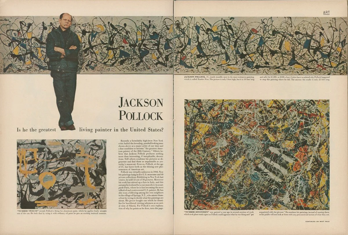
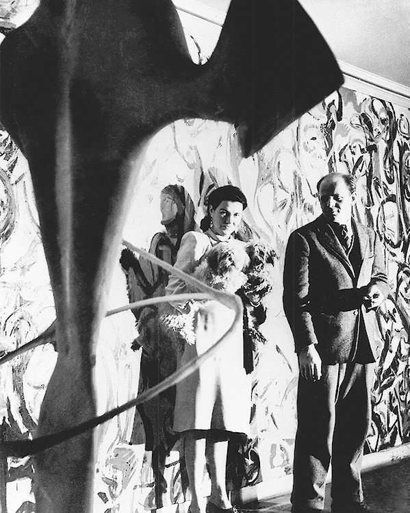
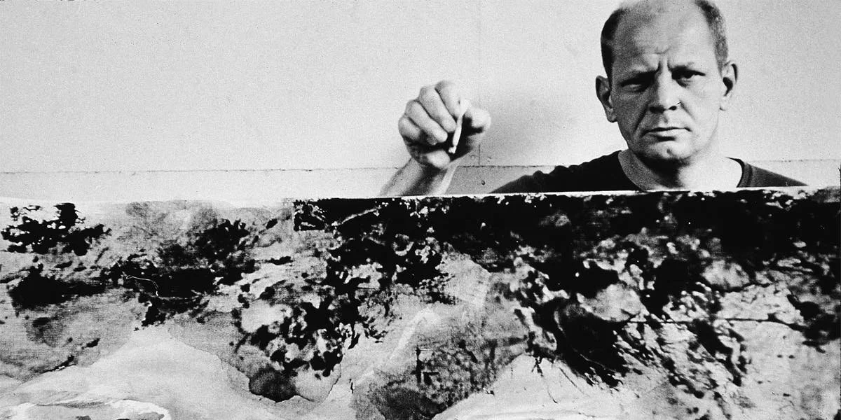
The dissolution of Abstract Expressionism into architecture is a period of time that helped me birth my concept and theory. Pre 1943 Jackson Pollock was an easel painter, however, this changed when he met Peggy Guggenheim, his first dealer, in 1943. She was an avid collector and eventually commissioned Pollock to paint a piece that filled the hallway of her home. Guggenheim’s new residence was the achievement of a modernist architect, the long foyer, measuring thirty-five feet in length, provided the artist with an expansive surface on which to work that was similar to the uninflected walls typical of modernist homes being built at that time. Initially, in true mural fashion, Pollock was to have painted the work directly on the wall. However, Marcel Duchamp suggested that he create a “portable mural,” so that Guggenheim could take it with her when she moved. Previously I mentioned Marcel Duchamp as an important figure in this conceptual birth as he started to adapt the interior setting of his work to become an extension of it, rather than housing for it. Here Duchamp and Pollock have a conversation about the direction of his work. I believe this perhaps sparked thought within Pollock to push the boundaries of his work, what it represents and how he could successfully go onto incorporate his work into, and be a part of, an architectural setting.
Peggy Guggenheim and Jackson Pollock - 1943
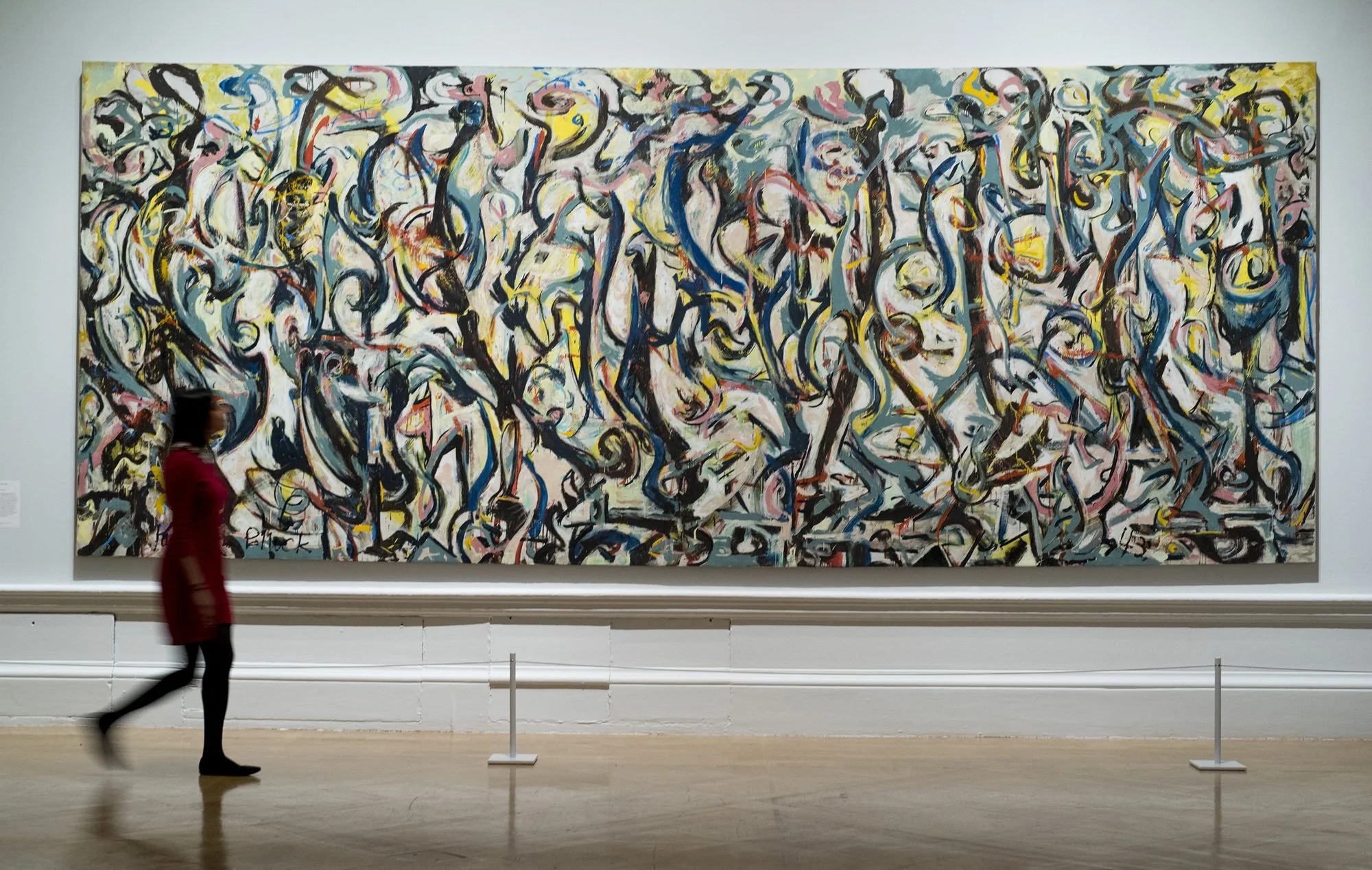
The official painting was called Mural and was completed in 1943. Pollock capitalised on Guggenheims’ narrow hallway to enforce upon the viewer a direct and close confrontation with the work. Due to the physical measurements and size of the hallway, the viewer did not have enough space to take in the painting in their entirety. The painting forces an aesthetic encounter upon the viewer while simultaneously conveying a sense of being walled in. The piece has no beginning, end, or centre; no up or down; no sense of top or bottom. Nor is there any distinction between foreground and background, which makes it spatially shallow. Mural redefined previous notions of twentieth-century mural painting and launched Pollock’s trajectory, culminating in his drip/pour paintings of the late 1940s and early 1950s that exhibit an architectonic quality, a material density that causes viewers as well as architects to either equate or treat them as walls as well as abstract paintings. Pollock completely redefined the viewing experience for his art with this commission and gave birth to a whole new conversation within the world of curation and architecture.
Jackson Pollock - Mural 1943

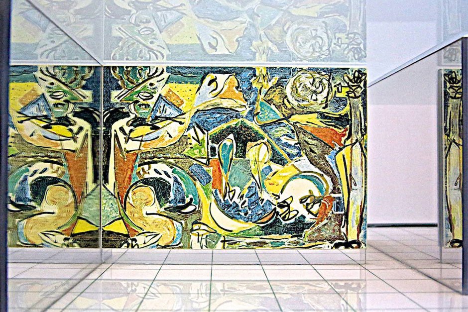
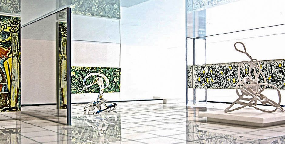
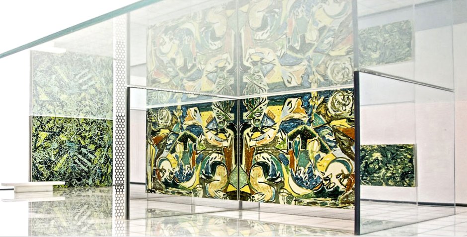
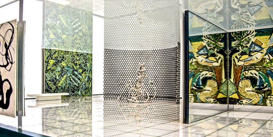
Ideal Museum 1949, Peter Blake and Jackson Pollock - Gallery
JACKSON POLLOCK AND PETER BLAKE - IDEAL MUSEUM
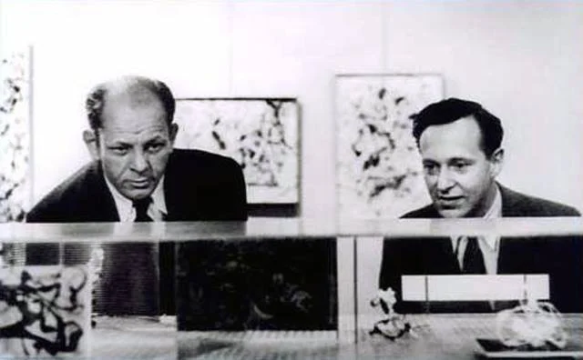
In 1947, Pollock met the Architect Peter Blake. This friendship was soon to become iconic, leading the charge of the integration of art, being into and a part of the home. Blake started to implement Pollock’s philosophies and ethics into his architectural designs. This took conceptual form in the designs for the Ideal Museum.
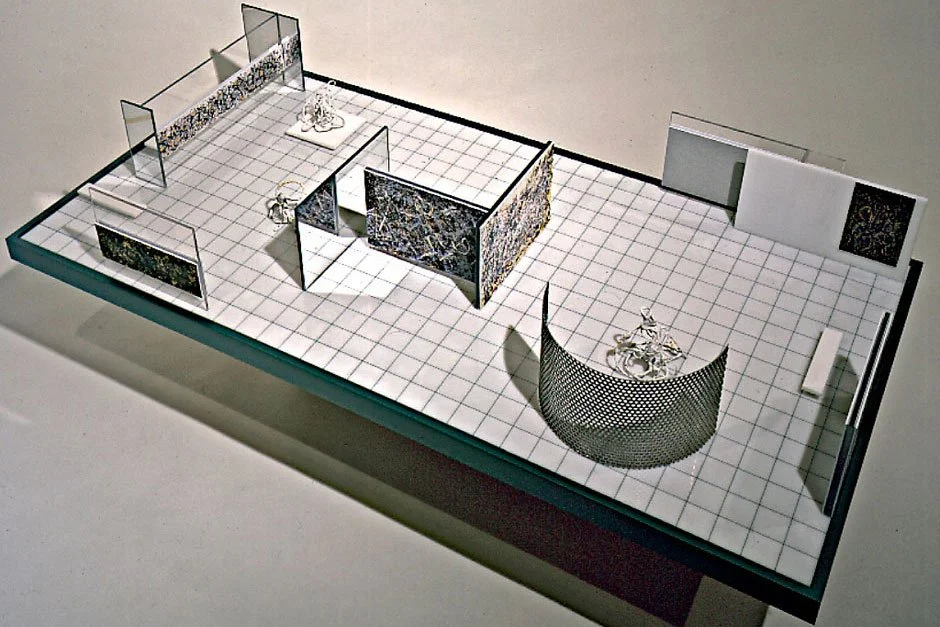
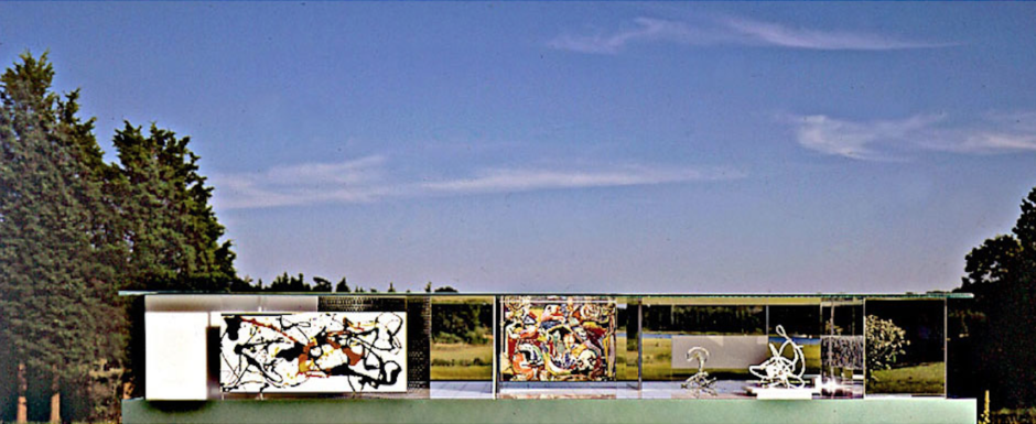
At this point, Pollock was becoming increasingly interested in producing paintings for specific architectural settings. His second exhibition at Parsons was scheduled for November– December of 1949, and he and Blake decided to title the show "Murals in Modern Architecture" as a way to promote the idea of incorporating his paintings within a modern architectural setting. To stimulate interest in their plan, Blake conceived and constructed what he called an “Ideal Museum”—a two-by-four foot model-sized building based on Mies van der Rohe's Ideal Museum for a Small City (1942), which in turn derived from Mies’s German Pavilion for the Barcelona International Exposition (1929)—within which he incorporated miniaturized versions of Pollock's paintings.
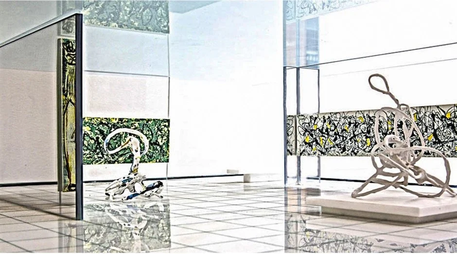
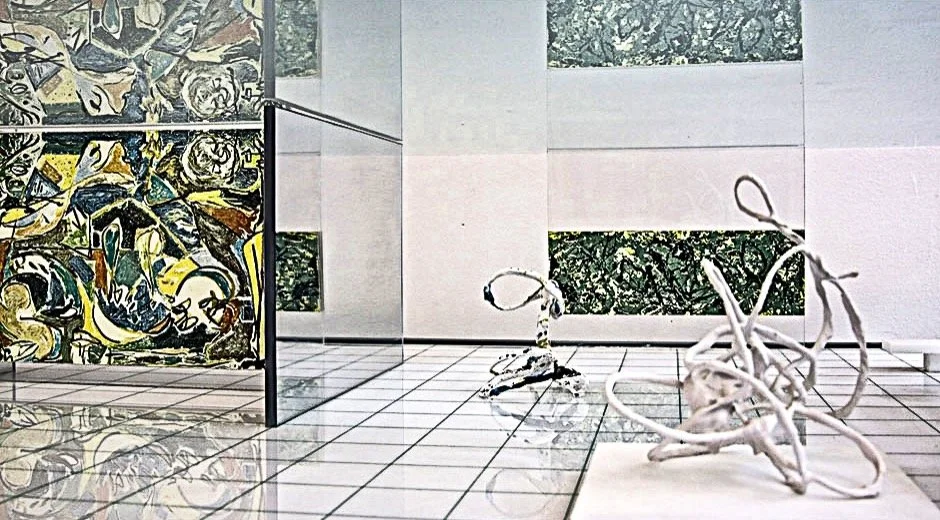
Blake’s model museum consisted of a simple, horizontal pavilion with a flat, opaque Plexiglas roof that hovered over the base. He left its sides open so that one could readily view the model’s interior where, in place of walls, Blake had divided the interior space with eight of Pollock’s “paintings” that stood freestanding or supported from the ceiling, forming both, exhibition and architecture.
Ideal Museum - Model - 1949
Ideal Musuem - Collage - 1949
Blake maintained their large size and scale relative to the dimensions of the “museum’s” interior. The Ideal Museum provided him with an opportunity to realize, in concept, the notion of an open plan in which Pollock’s paintings functioned as partition walls. In his memoir, “Unframed Space: Working with Pollock on the ‘Ideal Museum,’” he wrote, “the idea was to pretend it was an actual building, with a translucent roof about twelve feet above the floor. I had no idea how the roof could possibly be supported but I didn’t really care and I didn’t particularly care how big the paintings were in reality; I made them any size that seemed to be appropriate for the space.” By treating Pollock’s “paintings” as partitions or vertical constructions, Blake capitalized on their physicality. The “paintings” hung suspended between the floor and ceiling and thus functioned as walls in their own right, asserting their own spatial identity and defining interior recent “drip/pour” series with the exception of Gothic (1944) and The Key (1946) configurations. In some places, they actually supported the plastic roof. Arthur Drexler, Interior magazine’s architecture editor and future director of MoMA’s Architecture and Design department wrote in a review that “in its treatment of paintings as walls the design recalls an entirely different kind of pictorial art; that of the Renaissance fresco. The project suggests a re-integration of painting and architecture wherein painting is the architecture, but this time without message or content. Its sole purpose is to heighten our experience of space."
The perforated pegboard that Blake used for the “museum’s” floor also contributed to the notion of paintings as walls, for it permitted them to be moved around like modular wall units, which, at least in one instance, did occur. When Helen Harrison, director of the Pollock-Krasner Study Center, commissioned Blake to reconstruct the Ideal Museum in 1995, she felt it important that he once again utilize a gridded material for the floor in order to maintain the feeling of a modular system (while acknowledging that a perforated surface would be totally impractical in an actual museum).
The grided floor also recalls Le Corbusier’s Dom-ino system, which allowed partitions to be positioned as one wished within the grid, thus modulating the interior space. In fact, Blake’s Ideal Museum incorporated three of Le Corbusier’s cardinal principles: the free plan, in which Pollock’s “paintings” played an integral part, the free façade (non-supporting walls), and the flat roof. It would have included a fourth had Blake incorporated glass: ribbon windows. The Ideal Museum was never realized, but it does represent, at least in model form, the first instance of a modern museum designed explicitly to house a grouping of large abstract expressionist paintings.
Ideal Museum - Sculpture 1
Ideal Museum - Sculpture 2
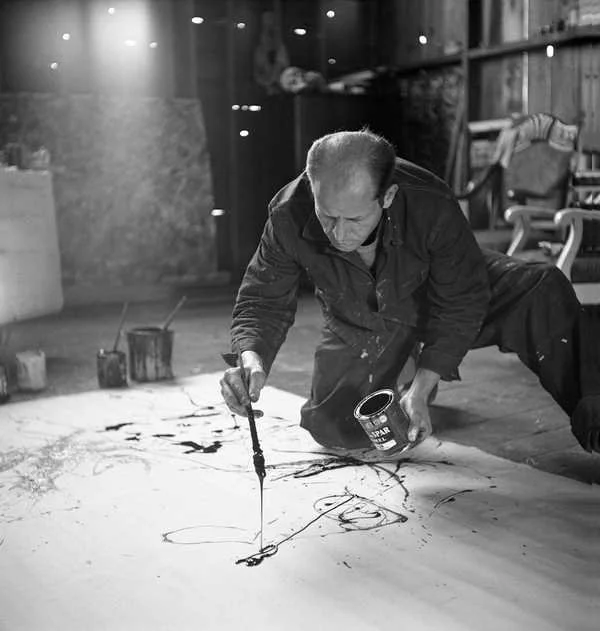
Jackson Pollock - Studio - 1949
Originally the museum was designed to revolve around the artwork, however, Blake later commissioned Pollock to make 3 sculptures specifically for this architectural environment, showing that the underlying philosophical conversation they were having through their work, was not of a linear nature. The Ideal Museum also highlights how architectural practicality within the design can have a direct positive effect on the somatic viewing experience. I believe this feature highlights a more symbiotic relationship between art and architecture rather than hierarchy.
Pinwheel House - 1954
Pollock and Blake - 1954
PINWHEEL HOUSE - CONCEPT DEVELOPMENT THROUGH ARCHITECTURAL LENS
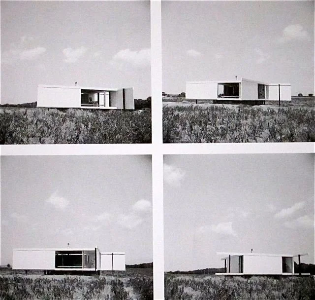
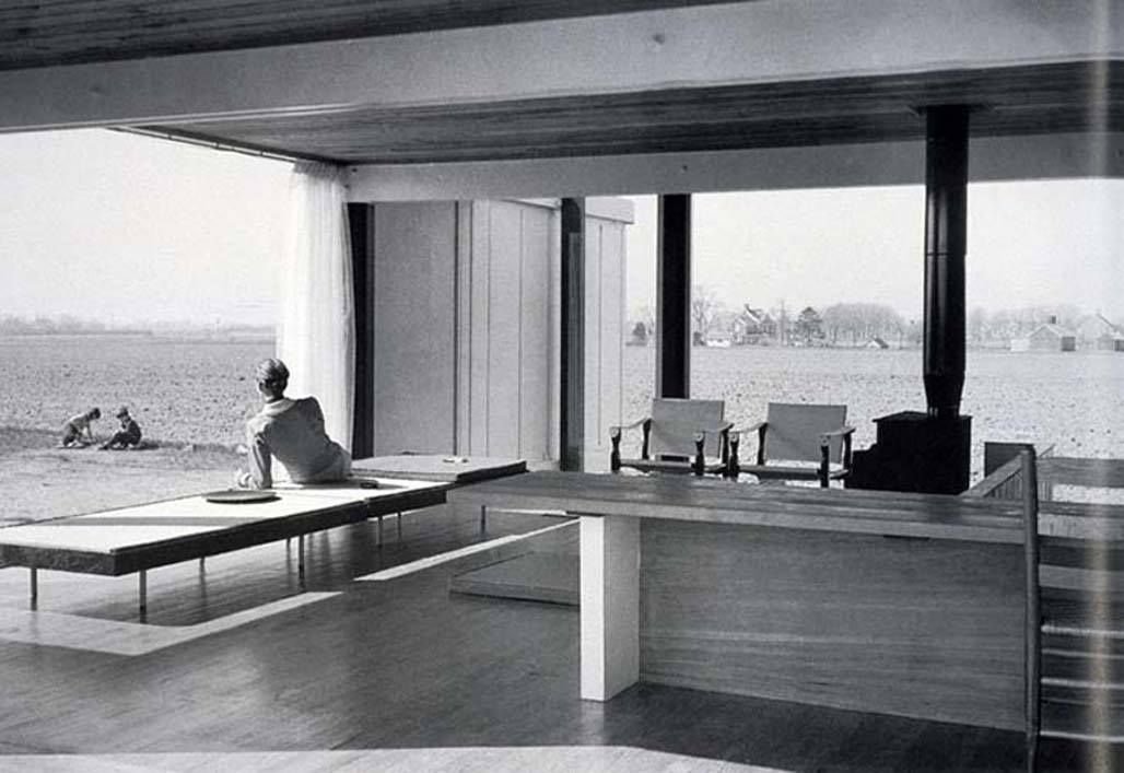
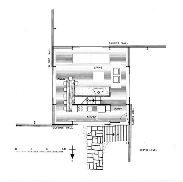
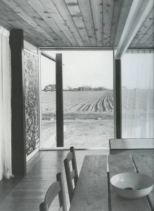
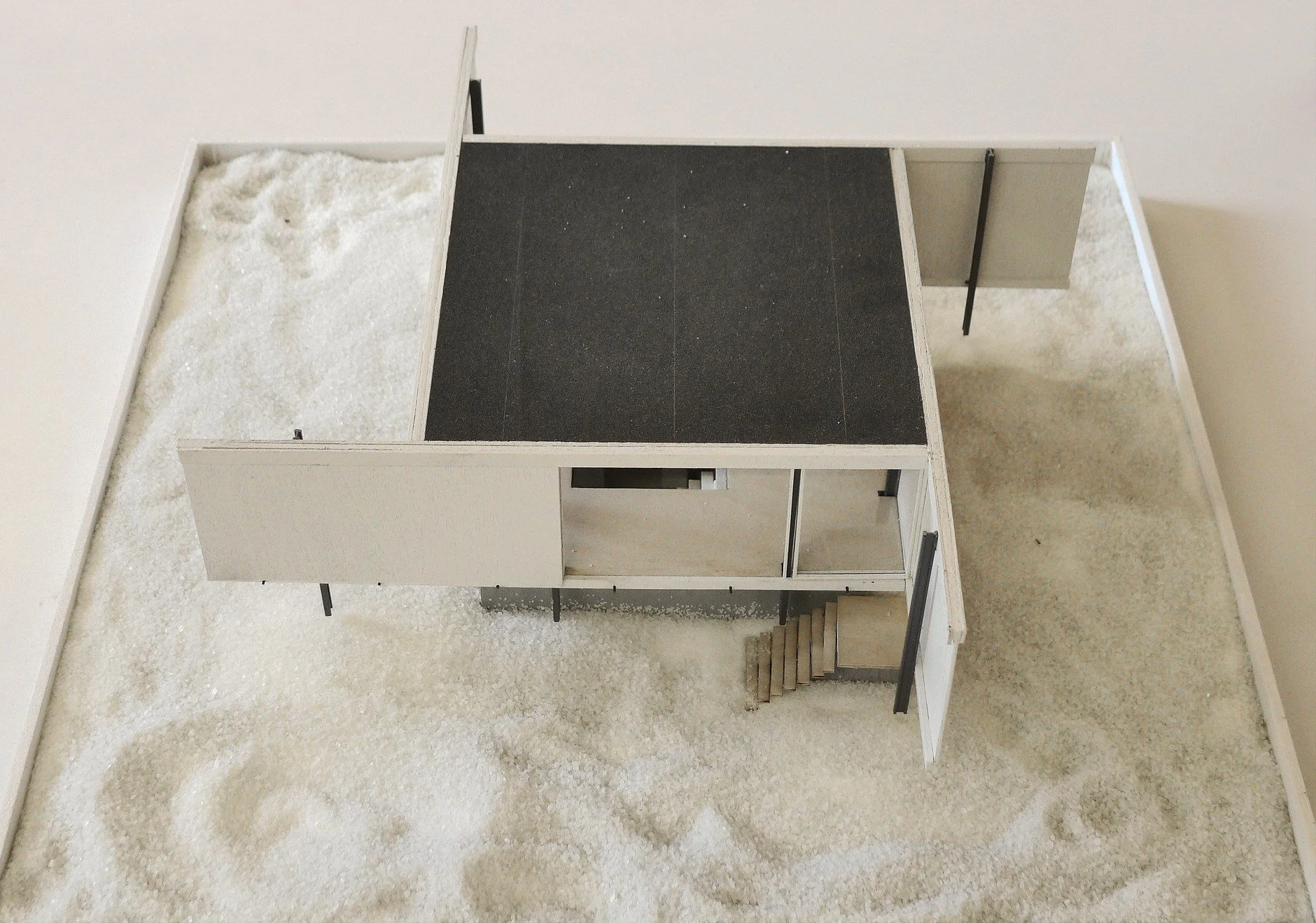
The concepts explored in the Ideal Museum were realised in the construction of Peter Blakes Beach House in 1954. The main feature of its design were the four outside walls, which were hung overhead from tracks so they could slide between the landscape and constructed space. Blake’s original plan was to have Pollock paint four eight by eighteen-foot paintings that would attach to the panels, acting as unframed walls, carrying the notion of unframed space first explored in the Ideal Museum, into architectural actuality. As Blake acknowledged, “I think his paintings might make terrific walls. After all, architects spend a lot of time thinking about walls. When open, the paintings would have extended out into the landscape. When closed, they would have created a painted environment.'“
Pinwheel House - 1954
Pinwheel House - 1954 - Floorplan
Blake completed the house, but without Pollock’s murals purely due to budget. Had he been able to afford the four Pollock paintings and used them as sliding walls, it would have been a complete assimilation of Pollock’s paintings into architecture. Pollock was the founder of the phenomenological viewing experience.
Pinwheel House - 1954
Pinwheel House - 1954 - Model
Pollock’s canvases do not convey a sense of deep space, but in fact, move so far forward toward their surface that they extend directly into the room and out toward the viewer to confront us. If Pollock and Blake did not fight regular convention and attempted to exert control over the presentation of their work, continue to push the boundaries of the display and use of multiple paintings at once (due to the impactful nature the of cocooning of the viewer in artwork can have on the space), I do not think modernist approaches to exhibition design would have evolved in quite the same way. Pollock was arguably the founder of the concept of unframed space which has led to the birth of ideas and design processes like the one I have constructed. Removing the frame became a philosophical ideology rather than a physical one. These ideas were later explored by Rothko and Breuer.
CONCLUSION
If we start to adopt principles from our past and look to our predecessors, in this case, the Surrealists and Abstract Expressionists of New York in 1950 and 1960, perhaps we can evolve our perceptions of art and architecture, changing the principles and boundaries that revolve around them. This incorporation, merging and arbitration of these principles, if evoked in a space’s architectural and interior design, could lead to the creation of spaces that express themselves upon the user, resonating once again on the same emotional level of historic spaces we hold so dearly to us. I want to capitalise on the notion of ‘Unframed Spaces’ and how its design and spatial parameters lead to the total immersion of the user within the work. I want to curate a space to create a sensory immersion for the user, creating a somatic experience through the space’s architectural and interior design. This will create spaces that spark emotional resonance, helping users understand and connect with the artist, art, motifs and narratives being displayed through the curation of exhibitions.
Jackson Pollock - Studio - 1949
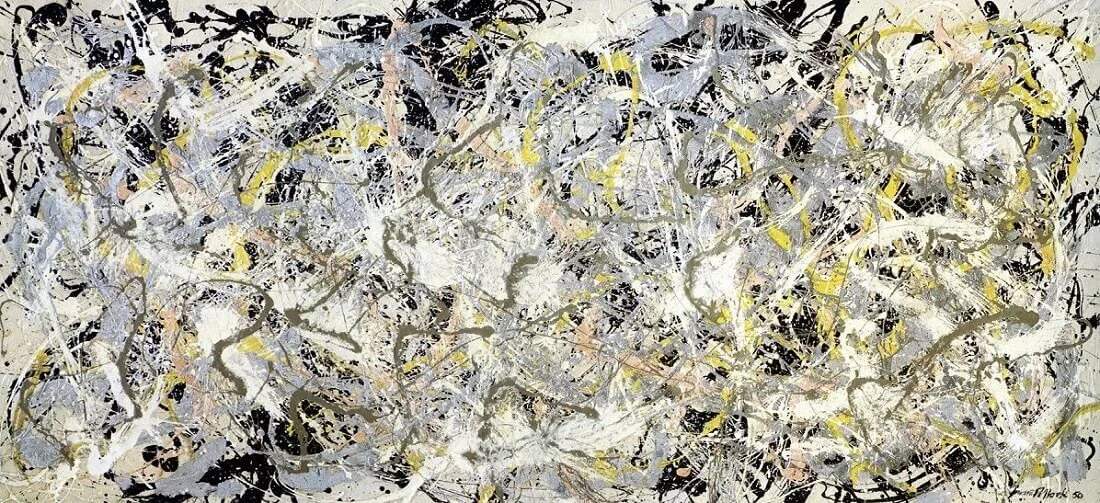
Jackson Pollock - Number 27 - 1950
MoMA - 1949
MoMA - 1949
FUNDAMENTAL AIM OF KISU
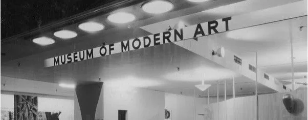
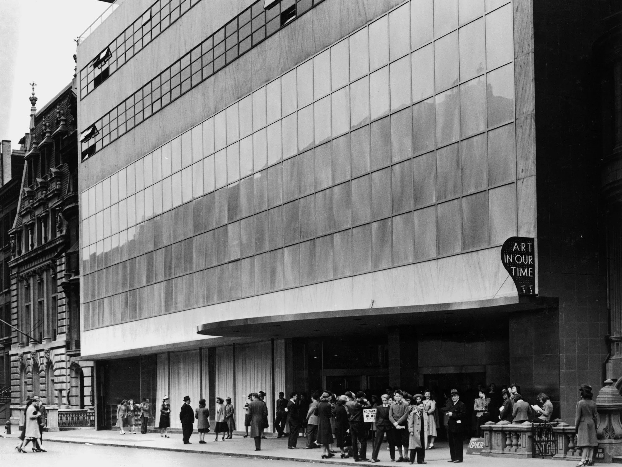
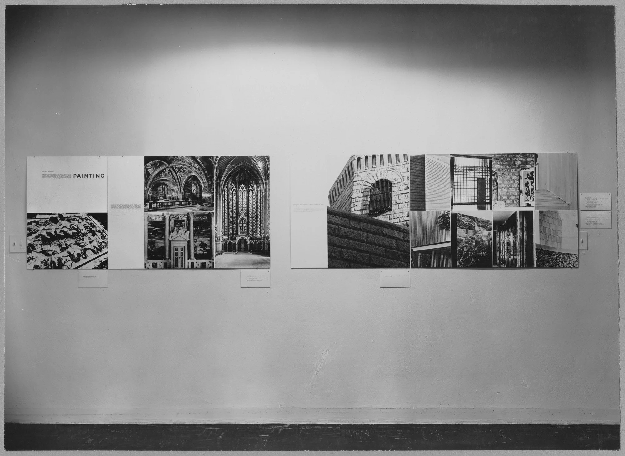
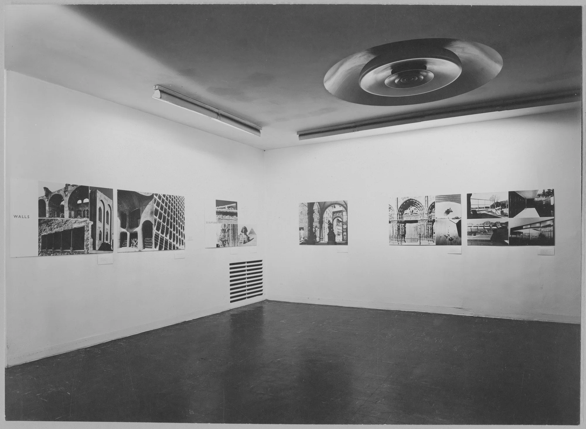
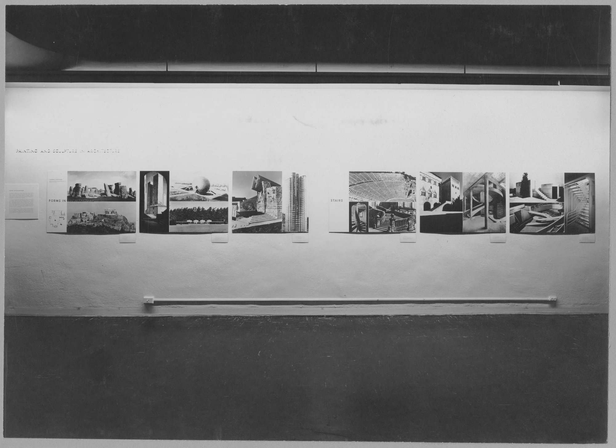
In 1949 The Moma in New York held an exhibition named “The Relation of Painting and Sculpture to Architecture,” a further opportunity to advance a discussion on the interdependence of art and architecture. Panel members included Hitchcock, Frederick Kiesler, and James Johnson Sweeney, who felt it “urgent” to reintegrate art and architecture since the conception of any one of these [individual arts] in isolation is a limitation. Interrelated, as they have been in all the greatest periods of art, they contribute to one another. Isolated, they dry up, lose their associative values, become inbred, and spiritually dwarfed. The panel urged artists and architects to work in tandem to achieve a harmonious integration of contemporary abstract painting in modern architectural spaces. One audience member, Mark Rothko, eventually would. New York's commercial art galleries also promoted collaborations between artists and architects, at least partly in response to the fact that those who collected abstract expressionist paintings also commissioned modernist homes. Beginning in 1944 and continuing over the next decade, the Bertha Schaefer Gallery mounted a series of annual exhibitions, each titled “The Modern House Comes Alive,” which presented scale models of contemporary houses by prominent architects, whose interiors included works created by contemporary artists.
The Relation of Painting, Sculpture and Art - 1949 MoMA - Room 1
The Relation of Painting, Sculpture and Art - 1949 MoMA - Room 2
The Relation of Painting, Sculpture and Art - 1949 MoMA - Room 3
Modern House Comes to Life - Bertha Schaefer Gallery - 1944
Modern House Comes to Life - Bertha Schaefer Gallery - 1944
Forever - Original Artwork - Kisu
Throughout my work, I want to echo the values that were presented in this exhibition. Through the collaboration of these practices, we can start to create truly inspiring spaces. If exhibitions are started to be curated this way, we can redefine the practice and bring it back to the highly perceptive, creative and bespoke role it once was. As society grows, so does its emotional intelligence, curating and designing spaces and exhibitions in this way can take the viewing experience of art into the realm of somatism, making it easier for audiences to connect and understand the aims and design goals of the spaces in question.
